A SIP OF STYLE: BEHIND THE LENS WITH TITO’S VODKA
March 31, 2025

A COLOR THAT DEMANDS ATTENTION
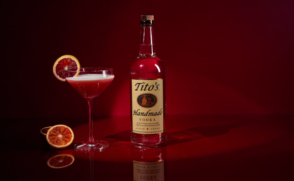
This recent shoot for Tito’s Vodka’s Valentine’s Day campaign was all about atmosphere—bold, romantic, and sultry. The client wanted a photo that oozed romance—the kind you’d find in a classic romance novel. Tito’s Vodka envisioned a setting that felt intimate, passionate, and unforgettable. The deep, wine-like red saturates the background, creating a rich, velvety canvas that draws the eye and sets the mood. While some reds whisper, this one shouts, and because its depth is so intense, it makes a truly unforgettable statement.
Every shoot is a collaboration, and this one was no exception. My incredible team made this vision come to life: Assistant Joe Reynolds, Beverage Stylist Kristina Wolter, and Digitech Tomas Segura. This shoot was an absolute blast. The energy on set was contagious, and collaborating with Tito’s Vodka team made it even more enjoyable. We laughed, we experimented, and we pushed creative boundaries to bring this vision to life.
SETTING THE SCENE: A BOLD BACKDROP
Does anyone remember the movie Who Framed Roger Rabbit? The scene where Jessica Rabbit steps onto the stage to perform Why Don’t You Do Right? starts in near darkness. Then, she appears—a vision in red, shimmering under a soft spotlight. That moment, that entrance, was my inspiration for this shoot. I wanted the background to do what that scene did—set the stage, command attention, and wrap the subject in an aura of intrigue. The deep, untextured crimson backdrop doesn’t just sit behind the subject; it frames it, pulling every element forward and making them impossible to ignore. This red isn’t just a color—it’s drama, it’s presence, it’s a performance in itself.
THE BLOOD ORANGE AND THE COCKTAIL: TEXTURE, CONTRAST, AND LIGHT
It was extremely important to the client to show off the juiciness of the blood orange and all of the intricate details inside of the orange. They wanted the viewer to almost taste the tart, citrusy burst and see the delicate, fibrous segments that make each slice unique. The deep ruby flesh of the orange, speckled with lighter citrus veins, creates a mesmerizing contrast against the smooth, structured backdrop.
WHY COLOR MATTERS IN COMMERCIAL FOOD PHOTOGRAPHY
Color is a combination of decoration, psychology, and storytelling. Studies in color psychology show that red can stimulate appetite, evoke strong emotions like passion, and draw attention effectively. That’s why you see it in the world’s most famous logos, in the packaging of your favorite snacks, in the signage of fast-food chains. It’s a color that moves people—literally and emotionally.
In this image, the red fills the space. It creates emotion and heightens the senses. It draws the viewer in, making them feel the intensity of the moment, the richness of the drink, the sharp citrus notes that likely linger on the palate. And that’s the ultimate goal. To make someone not just see an image, but experience it as if they were there in real time.
FINAL THOUGHTS: THE ART OF COMPOSITION
This shoot will forever hold a special place in my heart. From the electrifying energy on set to the seamless collaboration with Tito’s team, every moment felt like magic. Working with Tito’s again was a dream come true, and I can’t wait for thrilling and creative adventures ahead.
Whether you’re a brand looking to create a campaign or a photographer aiming to elevate your craft, one thing is clear: color, when used with intention, has the power to transform an image from something seen to something felt.
And in the world of food and drink, feeling is everything.
If you have a project in mind and want to create stunning, evocative images that bring your vision to life, let’s collaborate. Reach out, and let’s make something unforgettable together!
Tito’s Vodka
Continue Reading
back to blog home